Pick an idea below, adapt it to your page, and let MidaGX turn it into a live experiment.
Start broad or jump into a category. Each idea includes the brand, context, and a shareable example page.
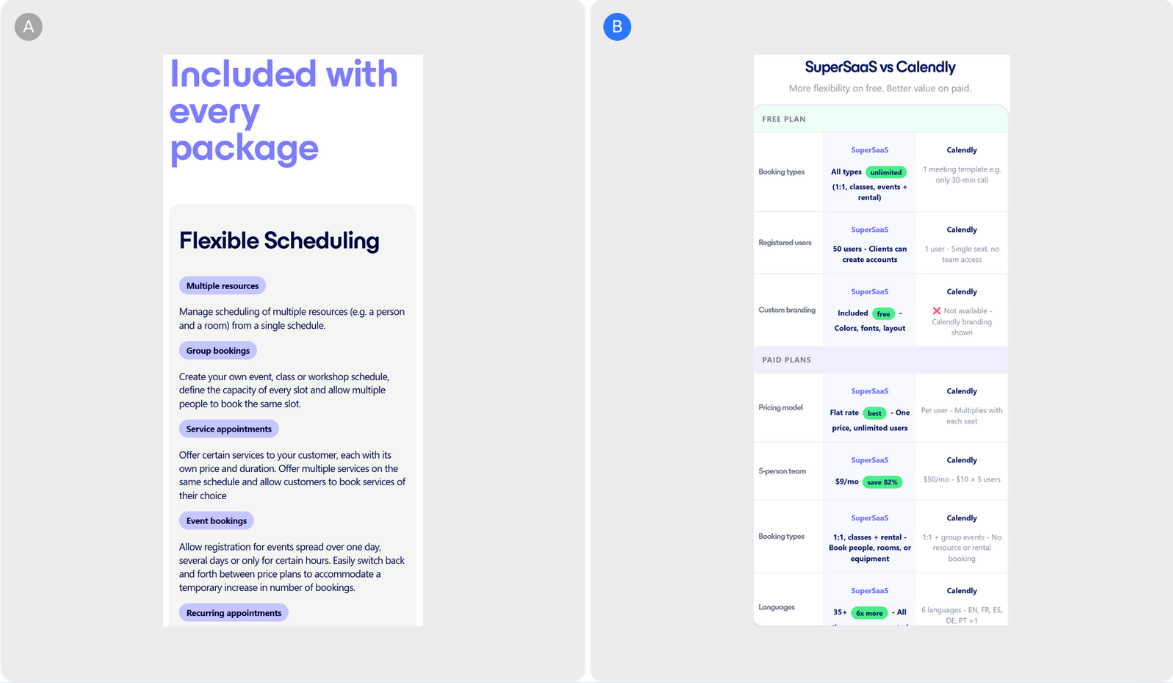 SuperSaaS
•
Monetization awareness
SuperSaaS
•
Monetization awareness
Hypothesis: Adding a feature comparison table below the pricing section — positioned where high-intent visitors are already evaluating the offer — converts the uncertainty of a category search into a clear c...
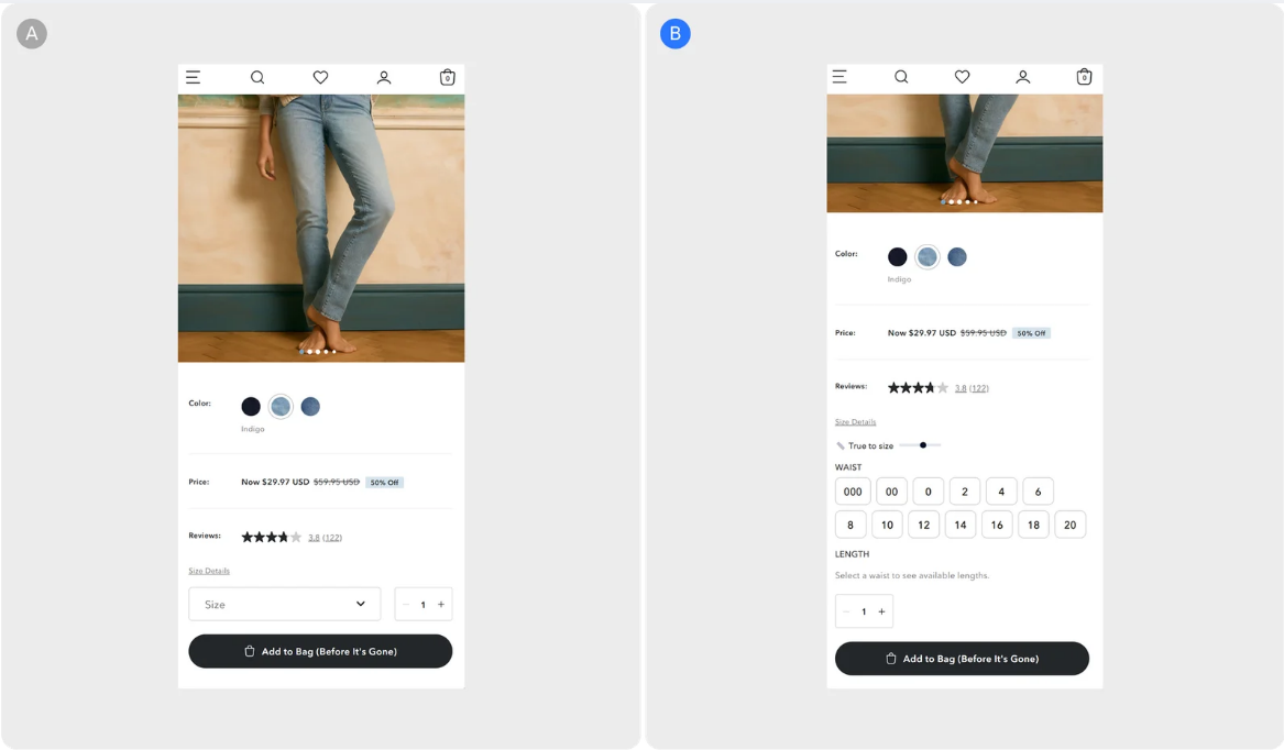
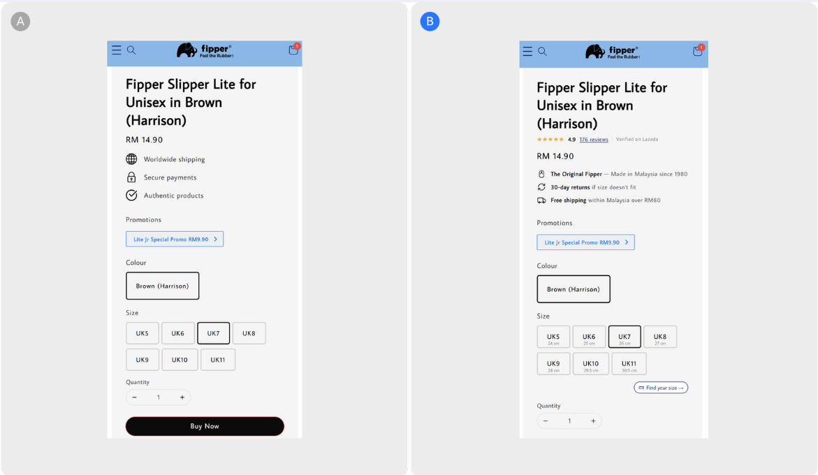 Fipper
•
Checkout & sales
Fipper
•
Checkout & sales
Hypothesis: Adding foot-length sizing guidance, surfacing verified Lazada reviews under the product title, and replacing generic trust badges with Fipper-specific signals removes the three barriers that prev...
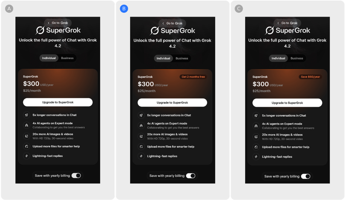 Grok
•
Monetization awareness
Grok
•
Monetization awareness
Hypothesis: Anchoring the annual plan to a specific savings figure — whether framed as "2 months free" or "save $60/year" — makes the long-term value of annual billing visible at the point of decision, and s...
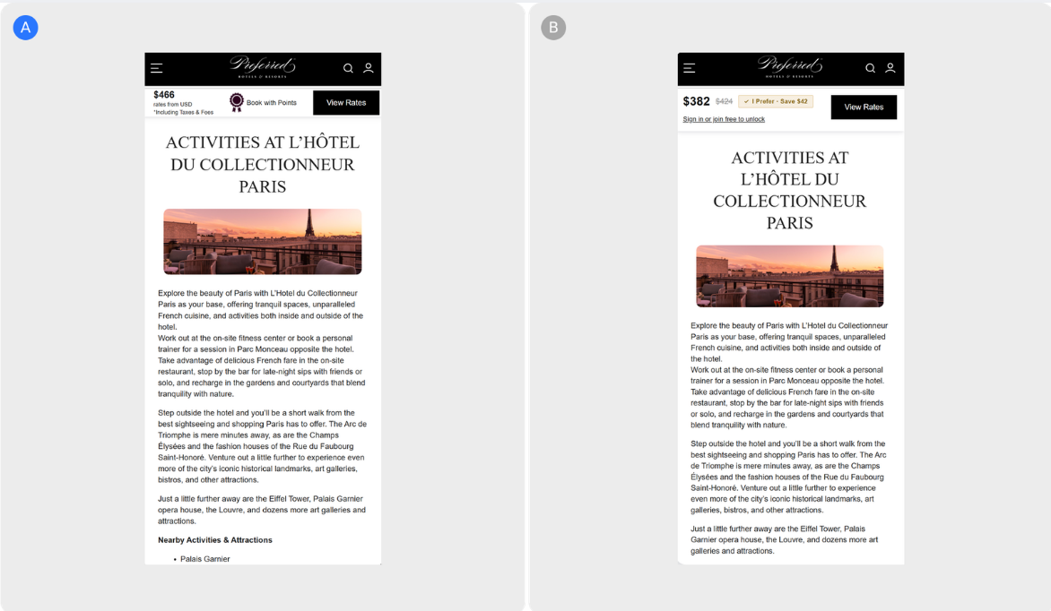 Preferred Hotels & Resorts
•
Checkout & sales
Preferred Hotels & Resorts
•
Checkout & sales
Hypothesis: Surfacing the I Prefer member rate directly on the property page price card — at the moment of price evaluation — will reduce the friction between intent and booking, giving shoppers immediate vi...
Brand of the Week Founded in 1977, American Eagle Outfitters has grown from a small Pittsburgh retailer into one of the most recognised American fashion brands, reporting over $5 billion in revenue in 2023 a...
 Warby Parker
•
Referral
Warby Parker
•
Referral
Hypothesis: Adding a second-opinion prompt inside the Virtual Try-On view reduces the gap between try-on and Add to Cart — and turns the share into an acquisition channel. Brand of the Week Warby Parker chan...
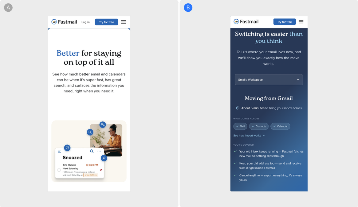 Fastmail
•
Paywall & free trial
Fastmail
•
Paywall & free trial
Hypothesis: Surfacing a provider-matched switching section as the first scroll below Fastmail's hero — one that directly answers the three questions most likely to defer a trial signup — will reduce the gap...
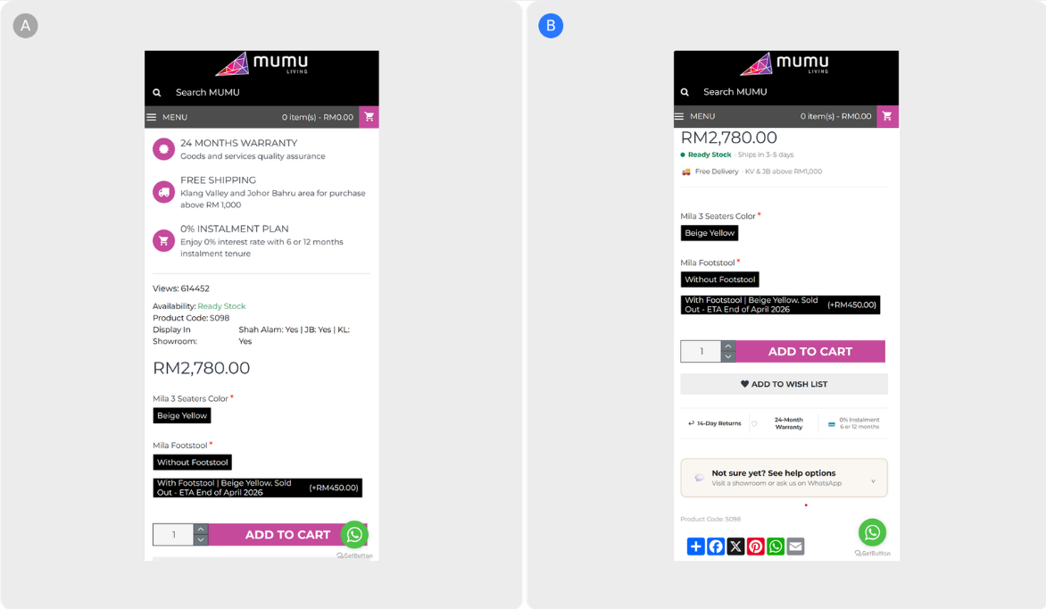 MUMU Living
•
Checkout & sales
MUMU Living
•
Checkout & sales
Hypothesis: Consolidating stock availability, delivery timelines, and trust signals around the Add to Cart button — and adding an in-page path to contact or visit a showroom — reduces the friction that sends...
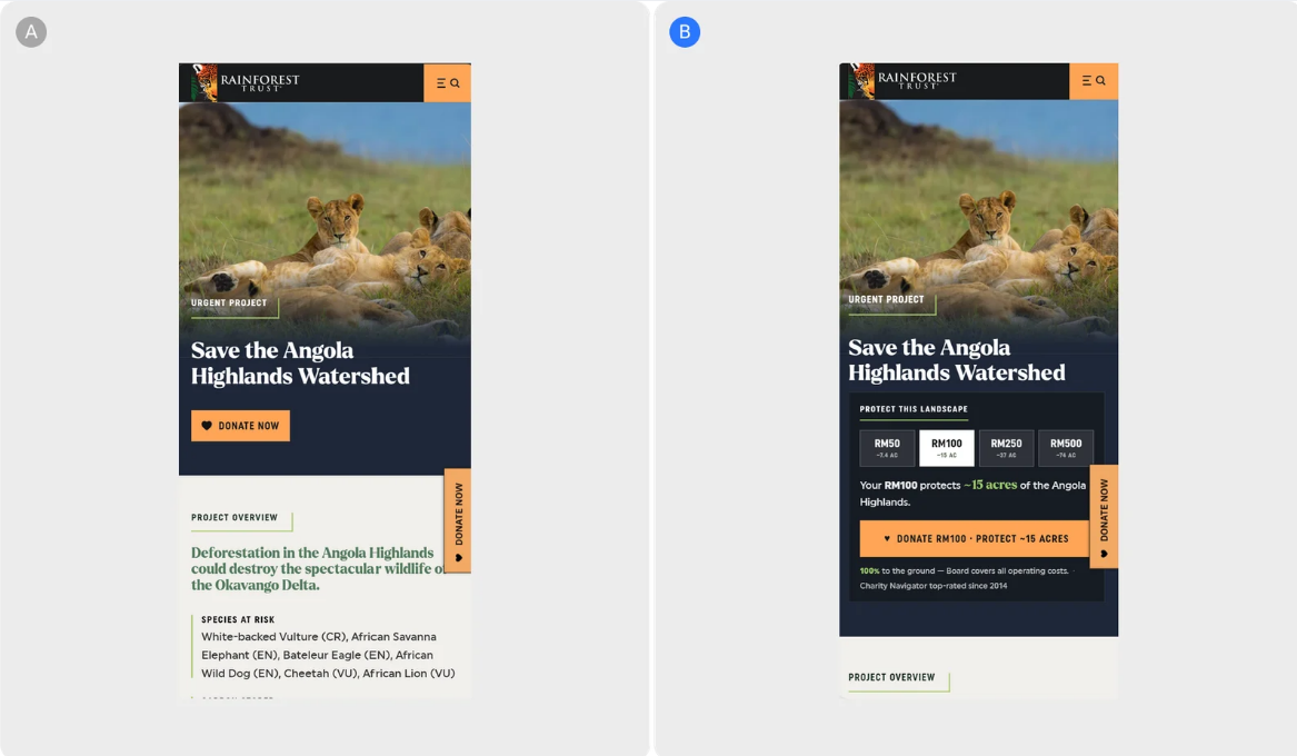 Rainforest Trust
•
Checkout & sales
Rainforest Trust
•
Checkout & sales
Hypothesis: Replacing the hero's bare donation CTA with a costed impact panel — preset amounts that each show the acres they protect, derived live from project data — will close the gap between the scale of...
 Pepper
•
Checkout & sales
Pepper
•
Checkout & sales
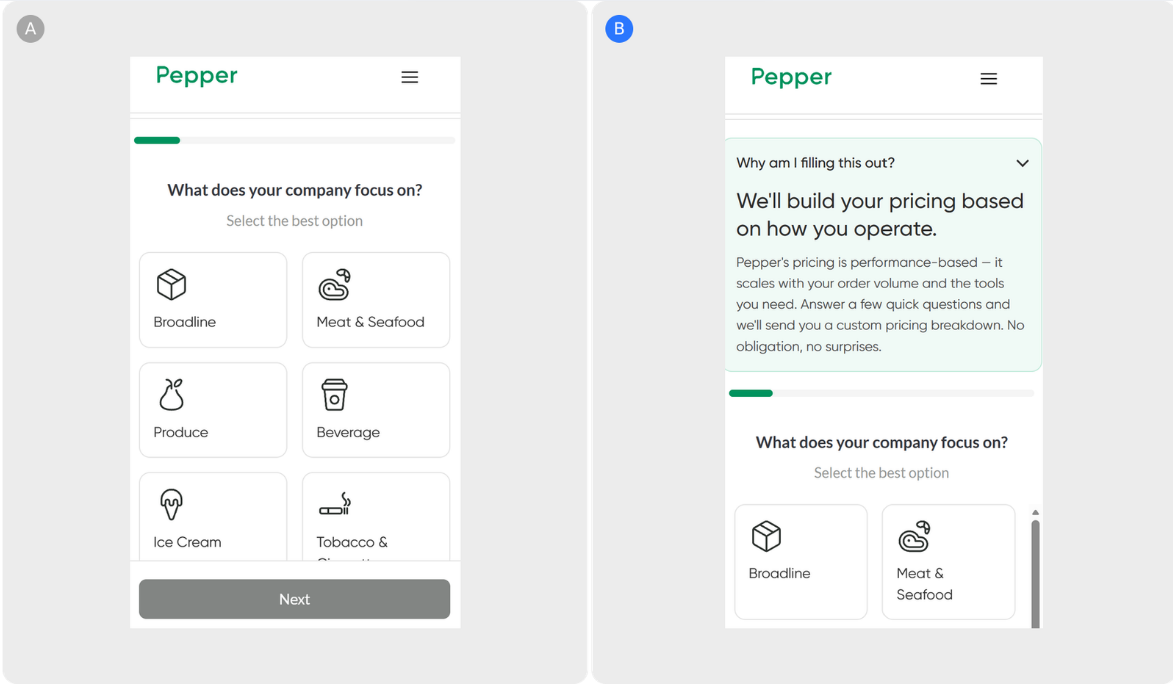
Hypothesis: Replacing the "Check Our Prices" CTA with "Get Your Custom Quote" and adding an explanatory intro section before the funnel will reduce drop-off by setting the right expectations before the first...
 Qive
•
User engagement & retention
Qive
•
User engagement & retention
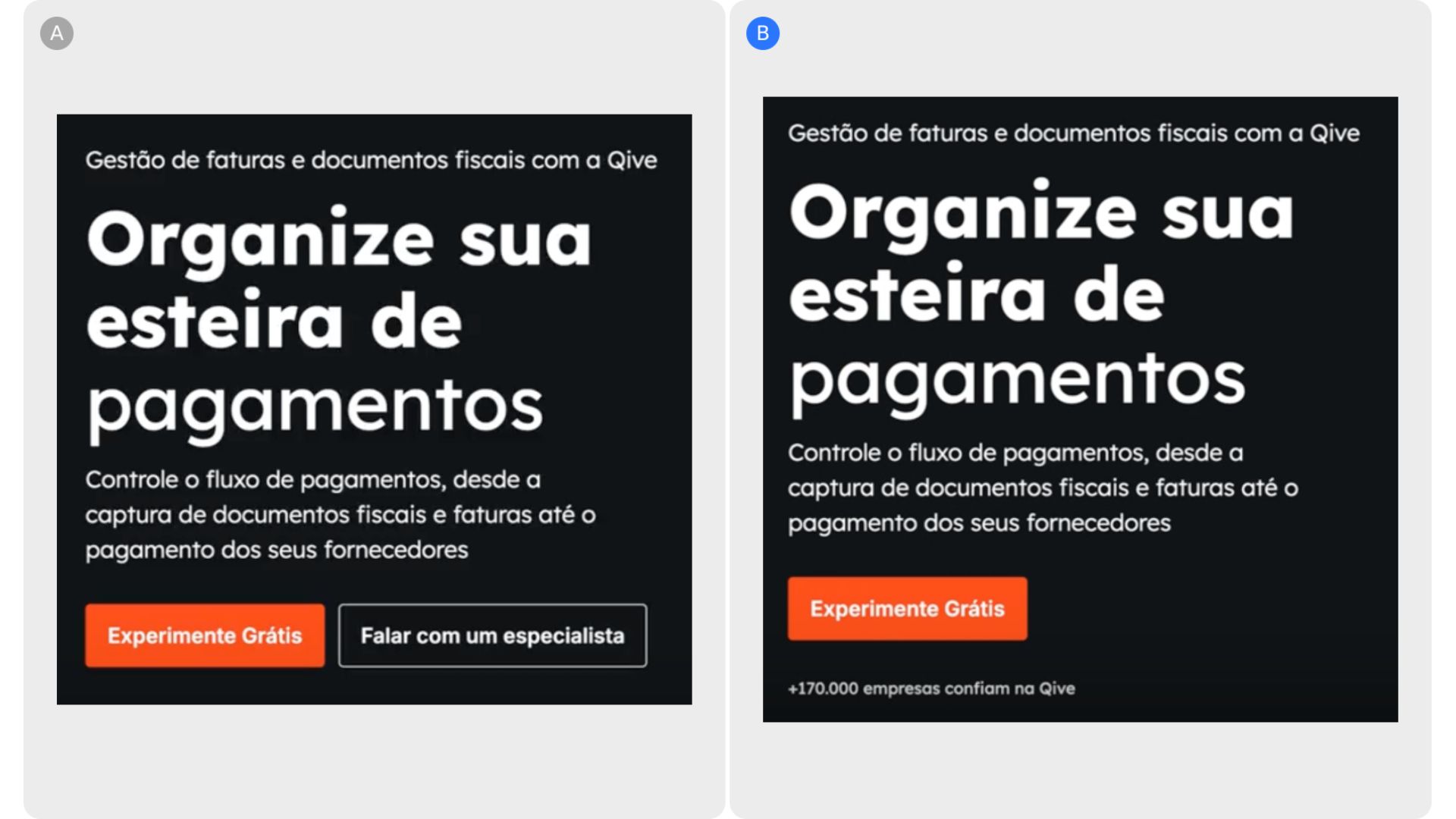
Qive’s landing page initially presented users with multiple CTAs at the point of entry, which likely split attention and introduced hesitation rather than guiding action. By simplifying the experience to a s...
 Stanley
•
Monetization awareness
Stanley
•
Monetization awareness
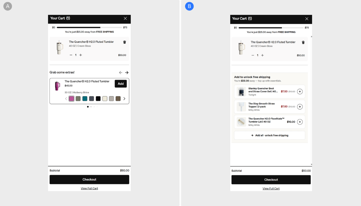
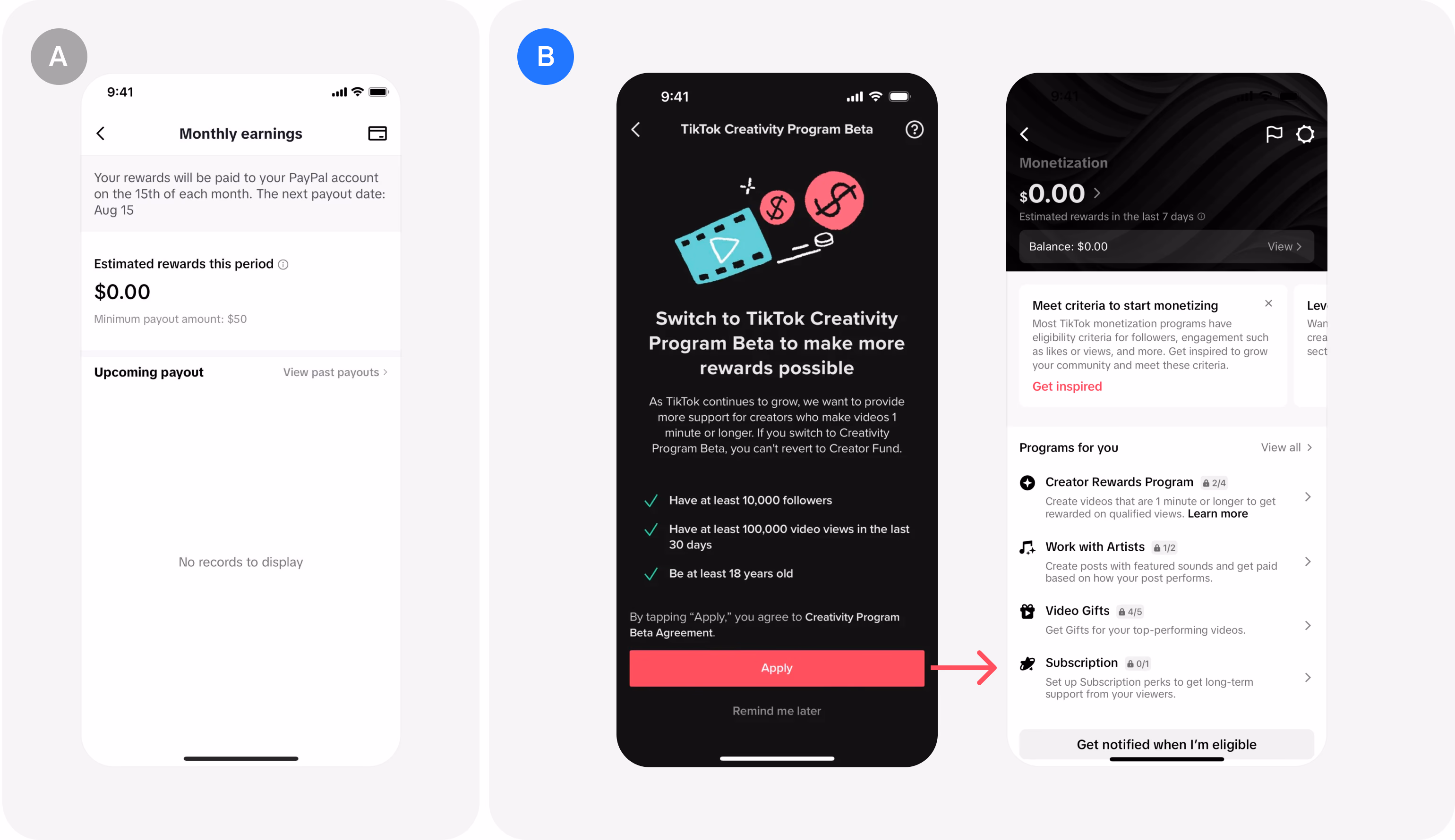
Hypothesis: Replacing the cart drawer's single full-price tumbler upsell with a smartly-sized accessories bundle — chosen by an algorithm that lands the combo's sum just under the free shipping gap — will ea...
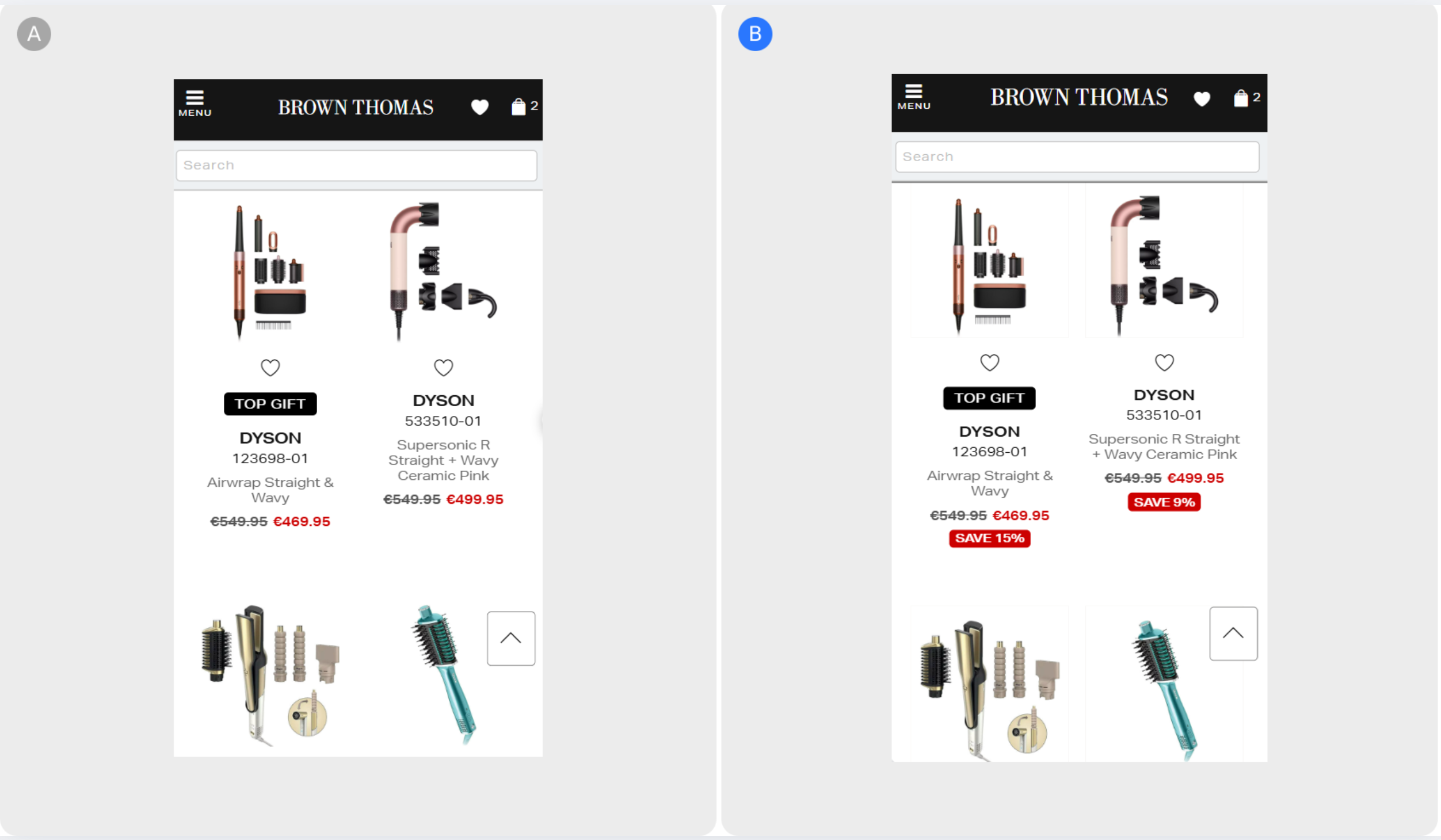
Brown Thomas’s discounted product listing page shows a variety of discounted products but the discounted prices lacked prominence. By including a red tag next to the price that is highly visible, it drives m...
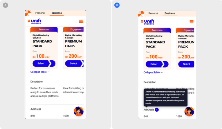 Unifi
•
Monetization awareness
Unifi
•
Monetization awareness
Hypothesis: Removing a redundant banner, anchoring 'Get Pricing' CTAs higher on the page, and adding a tooltip to the Ad Credits row reduces the effort required to evaluate the offer — and visitors who spend...
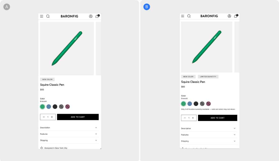 Baronfig
•
Checkout & sales
Baronfig
•
Checkout & sales
Hypothesis: Carrying Baronfig's own published scarcity labels through the full journey — plus a live, real-time availability line at the buy box — will convert more of the shoppers who currently hesitate on...
The page is currently extremely dense, with a hero search presented as a blank input that requires users to already know what to type, understand the correct terminology, and navigate a large, academic taxon...
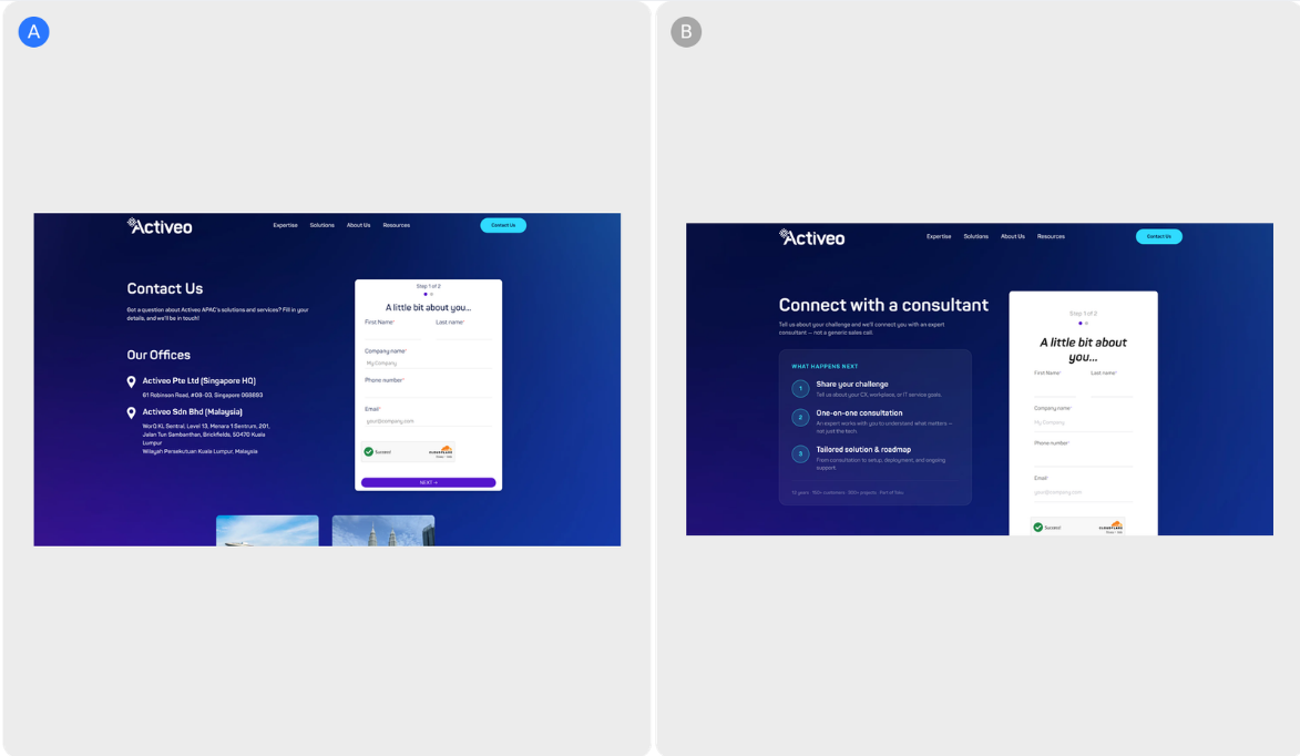 Activeo
•
User engagement & retention
Activeo
•
User engagement & retention
Hypothesis: Adding a step-by-step process block and subtle social proof to the contact page reduces the uncertainty that precedes a form submission — and gives prospective clients the context they need to ta...
 Union Goods
•
User engagement & retention
Union Goods
•
User engagement & retention
Union Goods’ hero section initially layered multiple elements—hero imagery, an Instagram hook, and a slogan—into a single visual space, increasing information density and making it harder for users to quickl...
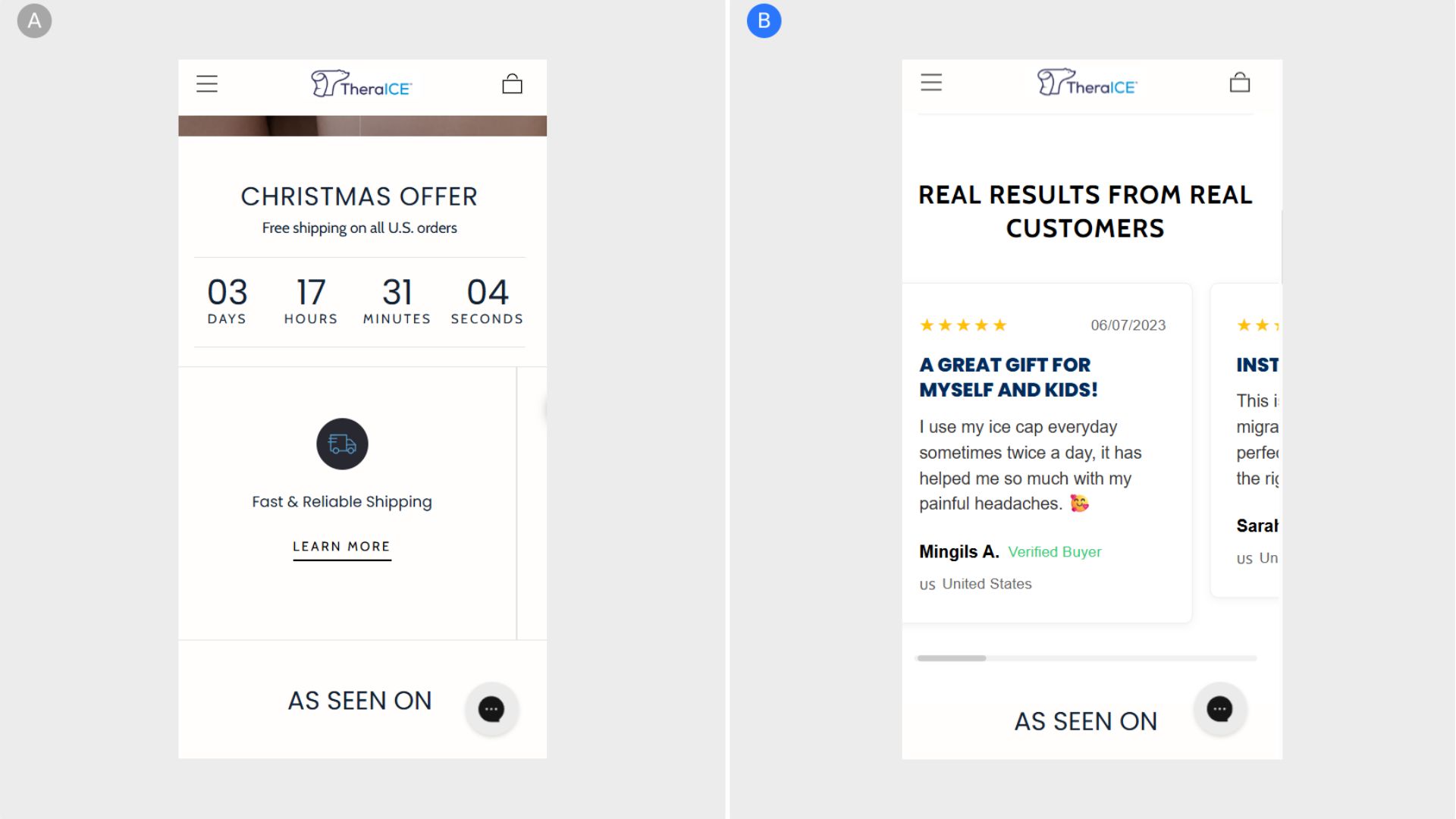
TheraICE’s homepage previously required users to scroll significantly to encounter reviews, and even then, feedback was limited to star ratings on individual product cards. By introducing a dedicated reviews...
 Adoption.com
•
User engagement & retention
Adoption.com
•
User engagement & retention
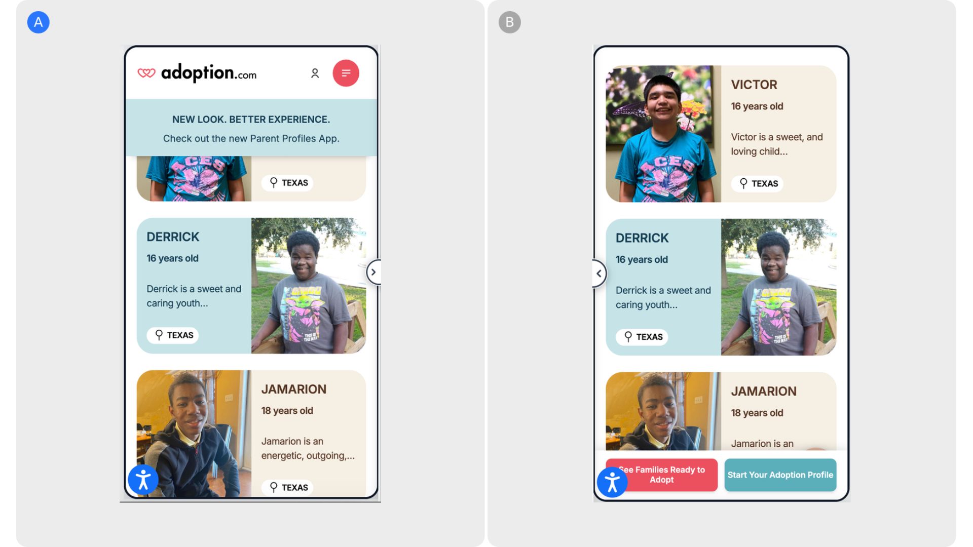
Adoption.com’s mobile experience previously allowed key CTAs to disappear as users scrolled, increasing the risk of drop-off at high-intent moments. The introduction of a sticky bottom bar keeps primary acti...
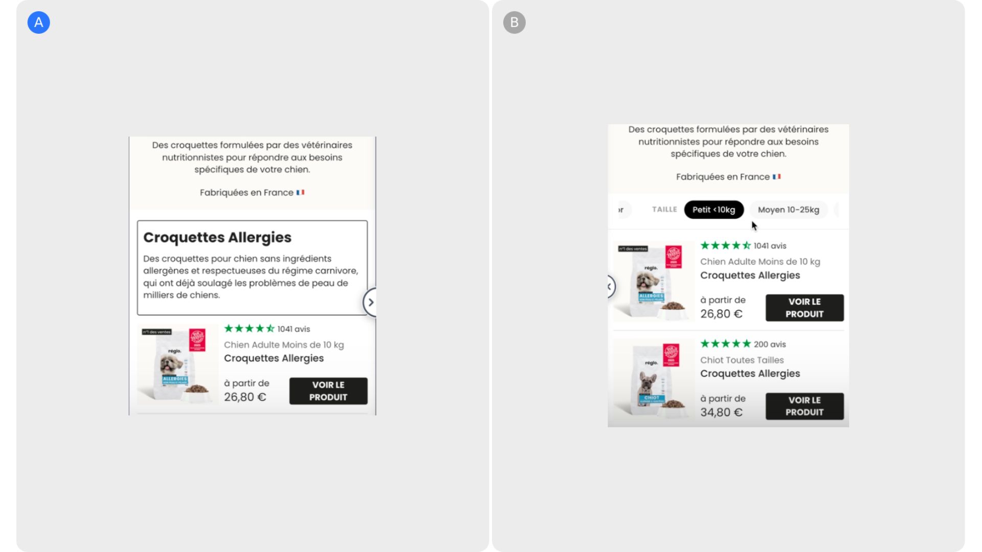
The product listing experience on Réglo initially required users to scroll extensively to locate relevant products for their dogs, increasing effort and slowing decision-making. By introducing a sticky filte...
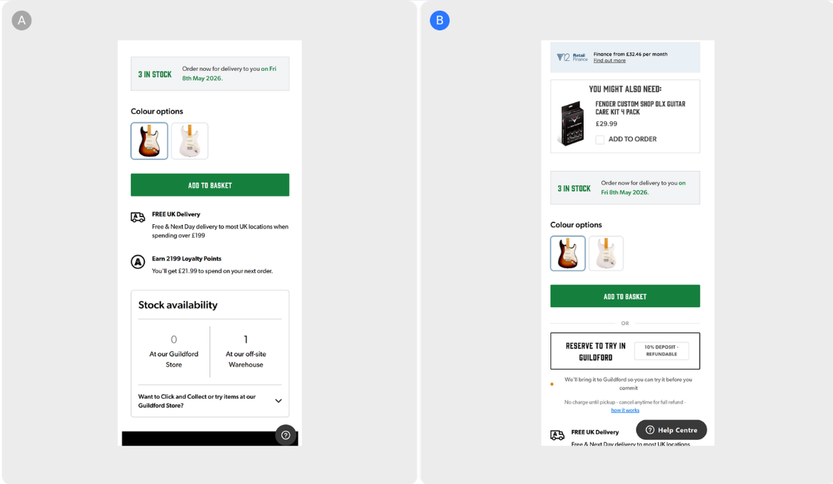 Andertons
•
Checkout & sales
Andertons
•
Checkout & sales
Hypothesis: Making the "Reserve to Try" CTA visible alongside ADD TO BASKET, removing conflicting stock signals, and explaining the reservation process in a four-step drawer reduces the hesitation that stops...
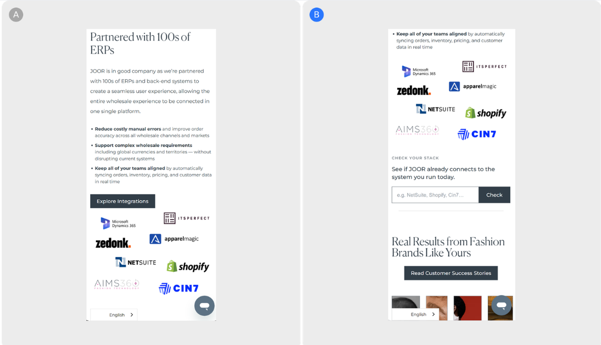 JOOR
•
Checkout & sales
JOOR
•
Checkout & sales
Hypothesis: Surfacing an interactive ERP compatibility lookup directly on the page will reduce the friction prospects face at the most critical evaluation point, giving them an immediate answer to their top...
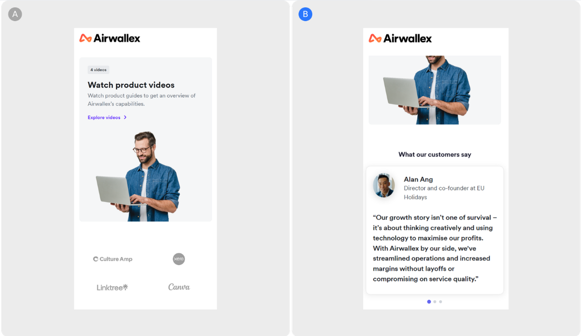 Airwallex
•
User engagement & retention
Airwallex
•
User engagement & retention
Hypothesis: Replacing a passive logo section with direct testimonials from recognizable brand leaders reduces uncertainty on the demo page — and gives visitors on the fence a clearer reason to book. Brand of...
Mida.so is a super lightweight A/B testing tool to help you experiment, analyze and implement conversion strategies in minutes.


Still deciding?
A quick screen share on your actual site — no slides, no generic tour. Just your questions answered.
30 min · no commitment · no sales pressure