
Boost, a Barcelona-based, AI-first CRO agency with a global presence across three continents, partnered with Svibe, an e-commerce intimate wellness brand, to test whether the visual tone of a landing page, not just its layout, could move revenue.
Svibe's mobile landing page for its bestselling product, the Snail Curve vibrator, used a bright, clinical product presentation: the kind of visual treatment that suits a general consumer gadget, but sits oddly with the mindset of someone browsing an intimate wellness product. Boost's hypothesis was that the page's tone was mismatched with visitor intent, and that mismatch was costing revenue, not just clicks.
Rather than guess, Boost used Mida to test the hypothesis directly. They built a redesigned version of the landing page with a darker, more sensual visual direction and tested it against the original on mobile, the primary channel for this traffic.
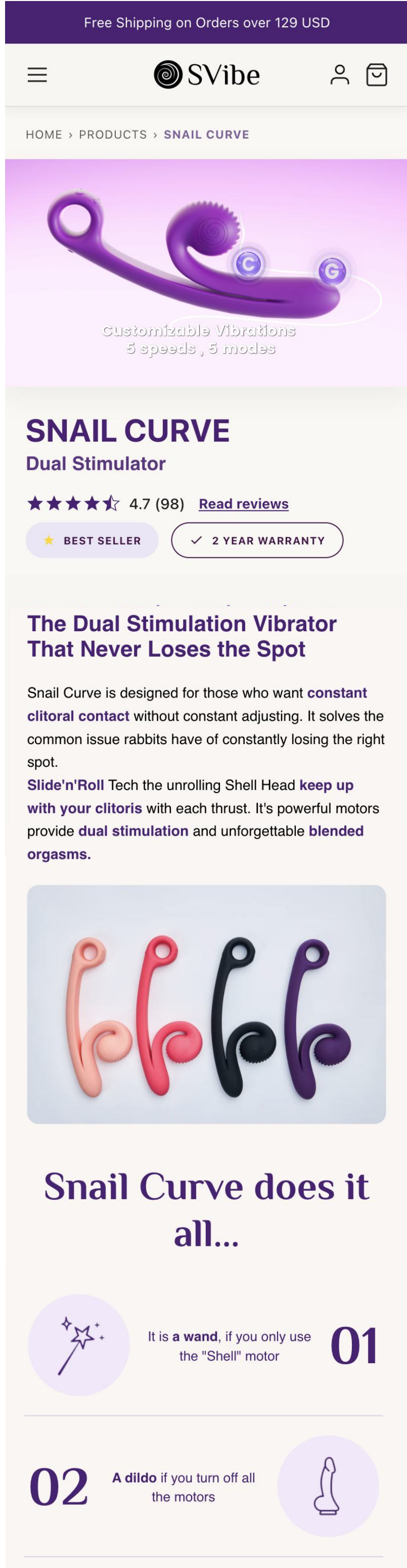
Before, Control A: a bright, clinical product presentation, the same visual language you'd use for a general gadget, not an intimate product.
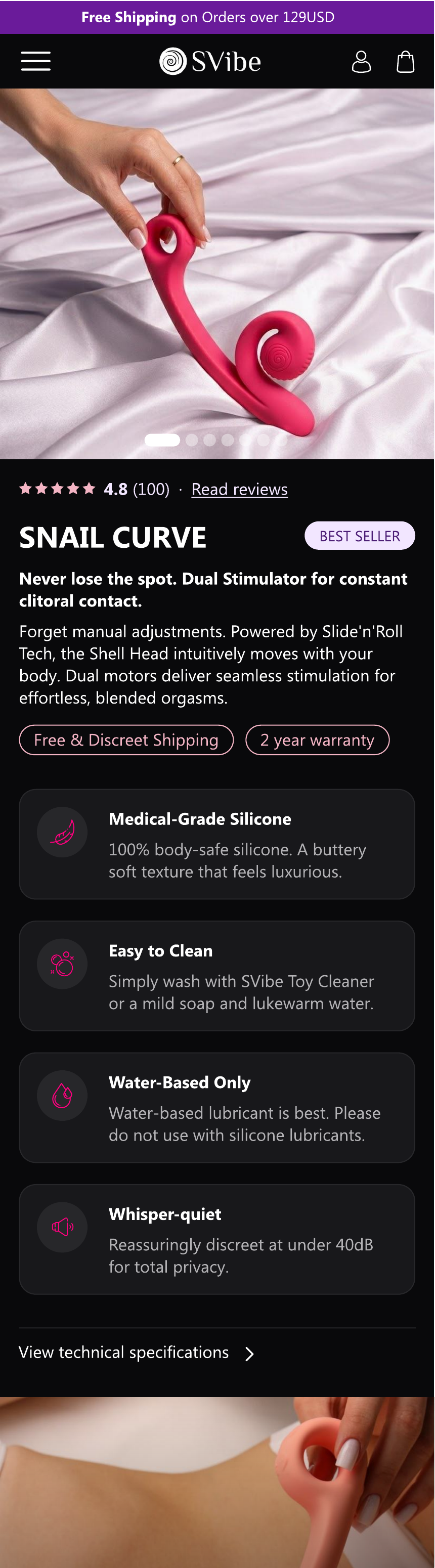
After, Variante B: a darker, more immersive visual direction: updated product photography, a moodier color palette, and a more sensory layout.
For a product in this category, the page isn't just conveying information, it's setting a mood that either matches or clashes with why the visitor is there. The clinical treatment was accurate but tonally off. The redesign leaned into atmosphere and sensory cues instead of just product specs, aiming to feel more aligned with the moment of intent that brought the visitor to the page in the first place.
Boost used Mida to run a mobile A/B test comparing the original landing page against the "Dark sensual" redesign, with Purchase (revenue-based) as the primary goal, tracked via Revenue Per Visitor (RPV). The test ran for 27 days across 18,061 visitors, split evenly between variants.
The "Dark sensual" variant won decisively, with a 99.6% probability to beat control, delivering a +33.9% uplift in Revenue Per Visitor (RPV).
Importantly, that lift wasn't driven by a single lever. It came from two compounding effects: a +31.1% increase in conversion rate, from 1.80% to 2.36%, and a +6.5% increase in average order value.
It's easy to assume a design change either brings in more buyers or gets existing buyers to spend more, rarely both. Here, the "Dark sensual" redesign moved both dials at once. More visitors converted into buyers, and the buyers who did convert spent more per order.
That combination suggests the redesign wasn't just removing friction, it was changing how visitors related to the product itself. A visual tone that resonates with purchase intent doesn't just make the page easier to say "yes" to; it can also shift what someone is willing to add to their order once they've said it.
Visual tone is not a cosmetic choice, it's a conversion lever. For products where the purchase decision is emotional or identity-linked, matching the page's visual language to the visitor's mindset can move both conversion rate and order value, not just one.
Measure revenue, not just conversion. Tracking Purchase via Revenue Per Visitor, rather than conversion rate alone, is what surfaced the full picture here: a redesign that looked like a "conversion test" was actually lifting both how many people bought and how much they spent.
If you're looking to optimize your website's performance and streamline your A/B testing process, Mida is the ideal solution.
With its lightweight script and focus on performance, Mida ensures that your website remains fast and responsive while offering powerful A/B testing capabilities. Experience the benefits of Mida by integrating our lightweight script into your website today.
---
Get started for free on Mida — up to 100,000 monthly tested users.
Mida is 10X faster than anything you have ever considered. Try it yourself.

Still deciding?
A quick screen share on your actual site — no slides, no generic tour. Just your questions answered.
30 min · no commitment · no sales pressure