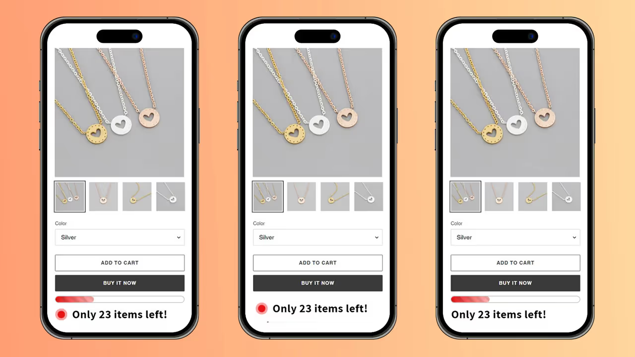
Displaying real-time inventory levels can create a sense of urgency and help customers make faster purchase decisions. This test explores enhancing the standard "In Stock" indicator with dynamic inventory information.
The variant design implements several scarcity indicators:
Key placement opportunities include:
Consider implementing inventory scarcity displays on your e-commerce site, especially for popular or limited-stock items. Focus on real-time accuracy and clear messaging to maintain trust. This approach can be particularly effective during peak shopping seasons or for exclusive product launches.
Pro tip: Combine this with email notifications for "Back in Stock" alerts to capture potential sales even when items are temporarily unavailable.

Mida is 10X faster than anything you have ever considered. Try it yourself.


