A leading online apparel retailer had been experiencing steady growth in its desktop sales. However, the company noticed a significant discrepancy between desktop and mobile conversion rates, despite the increasing number of mobile visitors.
The retailer's analytics revealed that while desktop users frequently utilized the search bar to find and purchase products quickly, mobile users rarely used this feature.
Upon investigation, it became clear that the search function on mobile devices was not as prominent or easily accessible as it was on desktop.
This resulted in lower engagement with the search feature and, consequently, fewer conversions from mobile traffic.
To address this issue, the retailer made the search bar expanded and always visible at the top of the page, regardless of how far down users scrolled.
This design change aimed to increase the prominence and accessibility of the search function, mirroring the ease of use that desktop users experienced.
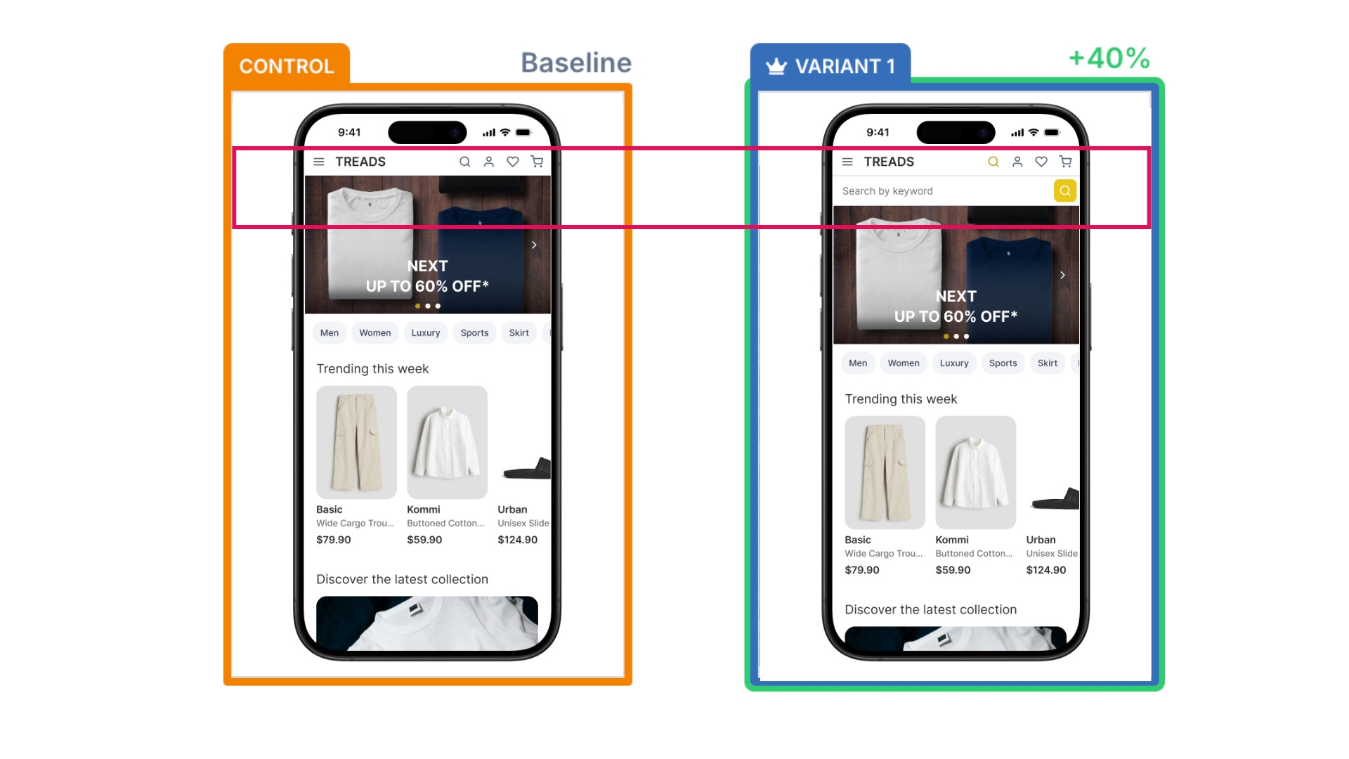
The retailer implemented an A/B test to measure the impact of this change. The results were remarkable, a 40% increase in purchase conversion rate from mobile users and significant increase in search function usage on mobile devices.
1. Increased visibility: By making the search bar expanded and always visible, users were more likely to notice and use this powerful tool.
2. Ease of use: The expanded search bar was easier to interact with on smaller screens, reducing the effort required to initiate a search.
3. Mimicking desktop behavior: The change allowed mobile users to adopt similar shopping patterns to those on desktop, where search was already a key driver of conversions.
4. Reduced friction: Users could quickly find what they were looking for without navigating through multiple categories or menus.
The success of this initiative highlights the value of data-driven decision-making and A/B testing in e-commerce.
Using Mida's A/B testing platform, the retailer was able to validate their hypothesis and quantify the impact of their changes, leading to a confident implementation that resulted in a 40% increase in mobile purchase conversions.
If you're looking to optimize your website's performance and streamline your A/B testing process, Mida is the ideal solution.
With its lightweight script and focus on performance, Mida ensures that your website remains fast and responsive while offering powerful A/B testing capabilities. Experience the benefits of Mida by integrating our lightweight script into your website today.
---
Get started for free on Mida — up to 100,000 monthly tested users.
Mida is 10X faster than anything you have ever considered. Try it yourself.

Mida.so is a super lightweight A/B testing tool to help you experiment, analyze and implement conversion strategies in minutes.


Still deciding?
A quick screen share on your actual site — no slides, no generic tour. Just your questions answered.
30 min · no commitment · no sales pressure