What is a Hero Image? Examples and Best Practices
Ever landed on a website and been immediately wowed by a stunning, full-width image or video at the top of the page? That, my friend, is a hero image.
A hero image is the superhero of web design, swooping in to grab your attention and set the tone for the entire site.
In this article, we'll dive into what makes these images so heroic, check out some killer examples, and explore best practices to make your hero image shine.
What Exactly is a Hero Image?
A hero image is a large, eye-catching visual element that typically spans the width of a webpage, sitting prominently above the fold. It's usually the first thing visitors see when they land on a site, making it crucial for creating that all-important first impression.

Think of it as the digital equivalent of a book cover or a movie poster. It's there to:
- Grab attention
- Set the mood
- Communicate the core message or value proposition
- Guide users towards key actions
Why Hero Images Matter in Web Design
Hero images are the big, bold visuals that greet visitors when they land on your website. They're not just pretty pictures – they're powerful tools that can make or break your site's success. Let's dive into why these bad boys are so crucial.
1. They Make a Killer First Impression
In the fast-paced world of the internet, you've got mere seconds to hook a visitor. A well-crafted hero image can stop scrollers in their tracks and entice them to explore further. It's like that moment when you walk into a party and everyone turns to look – you want your site to have that same "wow" factor.
2. They Tell a Story at a Glance
A picture is worth a thousand words, right? A hero image can convey your brand's essence, product benefits, or the mood of your content faster than any text could. It's like a visual elevator pitch for your site.
3. They Guide User Focus
By strategically placing text, call-to-action buttons, or product highlights within or around the hero image, you can direct user attention exactly where you want it. It's like being a traffic cop for eyeballs.
4. They Boost User Experience
A visually appealing hero image can make browsing more enjoyable and can significantly impact your conversion rates. It's the difference between walking into a bare, boring room and one that's been thoughtfully decorated.
5. They Set the Tone
Your hero image is like the opening act of a concert – it sets the mood for everything that follows. Whether you're going for professional, playful, or provocative, your hero image can nail that vibe right off the bat.
6. They're Mobile-Friendly
With more people browsing on their phones than ever, a well-designed hero image can adapt seamlessly across devices. It's like having a chameleon that looks good no matter where it goes.
7. They Can Showcase Your Products
For e-commerce sites, hero images are prime real estate for showing off your best sellers or latest products. It's like having a digital storefront window that you can change up anytime.
Hero Image Examples: Inspiration from the Best
Let's look at some real-world examples of hero images done right:
1. Apple - Product Showcase
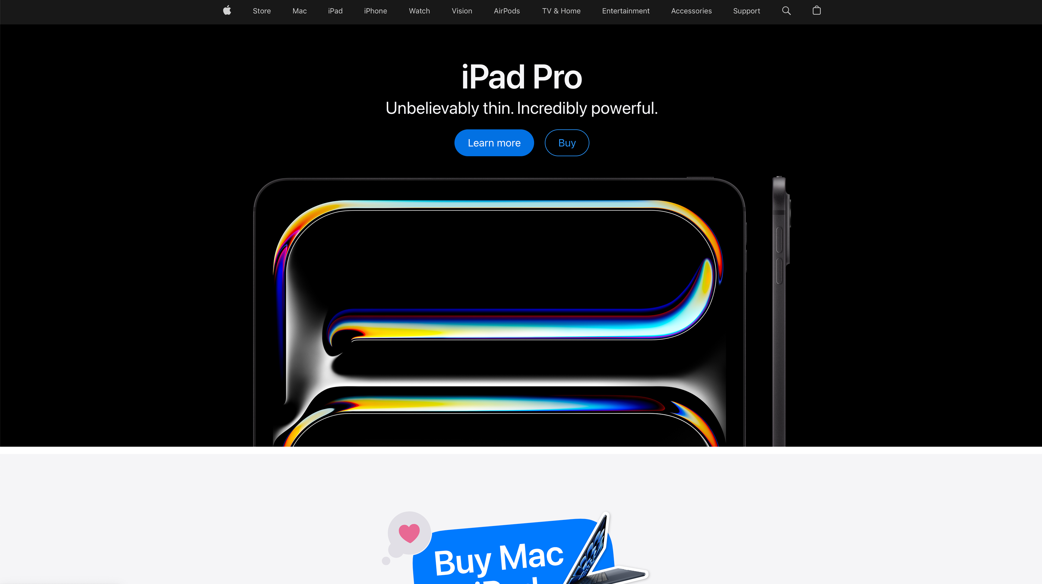
Apple's hero images are legendary for their clean, product-focused approach. They let their devices shine against simple backgrounds, often using subtle animations to highlight features.

2. Airbnb - Lifestyle and Emotion
Airbnb uses hero images that evoke the excitement of travel and unique stays. They often feature inviting interiors or stunning landscapes, making you want to book a trip right away.
3. Nike - Action and Inspiration
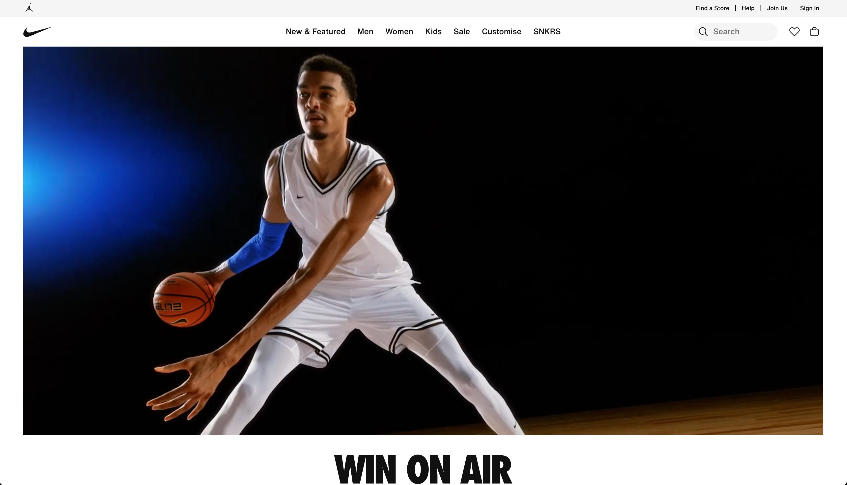
Nike's hero images often feature athletes in action, embodying their "Just Do It" slogan. These dynamic images inspire and motivate, perfectly aligning with their brand identity.

4. Dropbox - Simplicity and Clarity
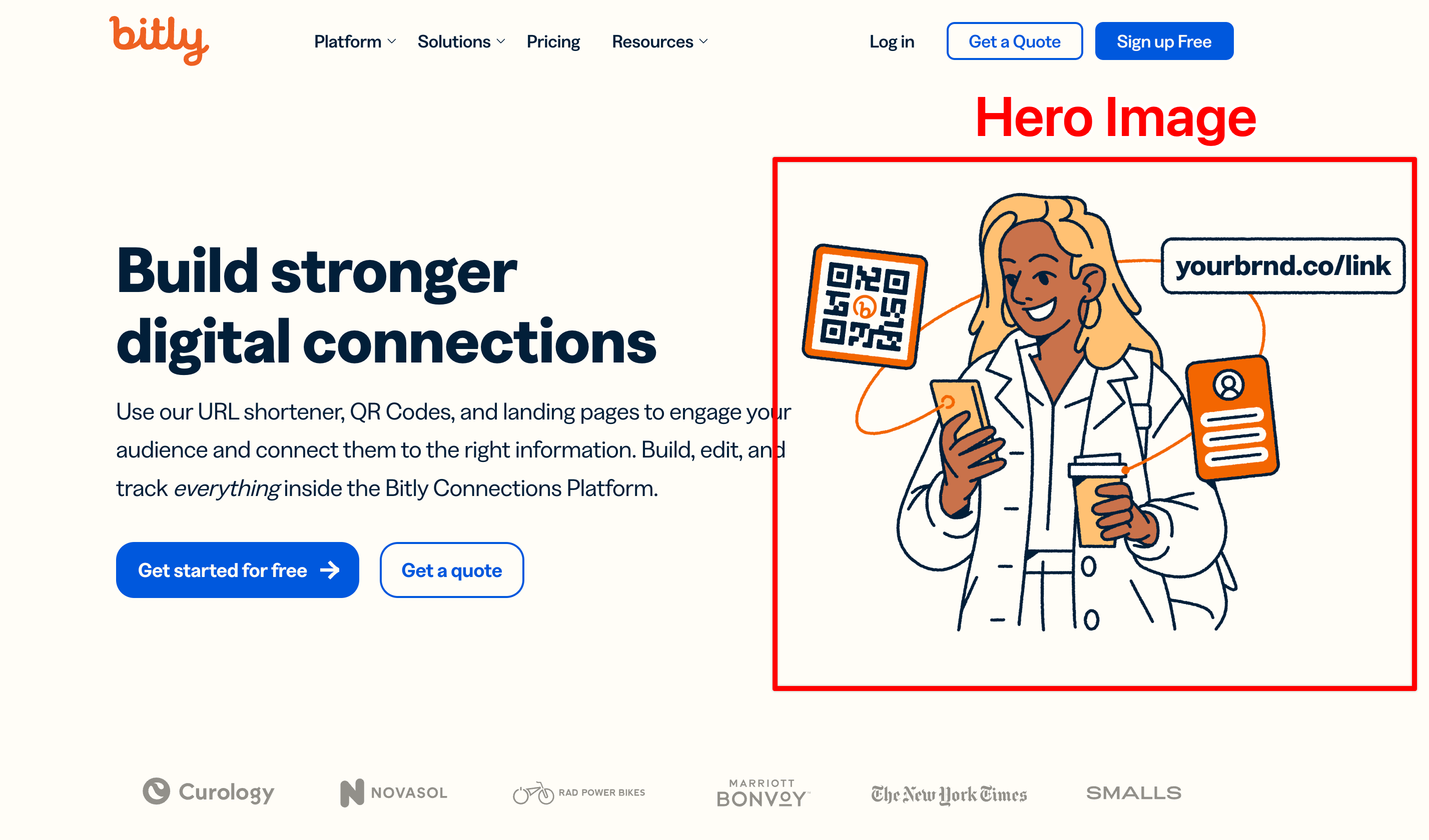
Dropbox opts for simple, illustrated hero images that clearly communicate their service's benefits. Their use of whitespace and minimal color palette creates a clean, user-friendly feel.
5. GoPro - User-Generated Content
GoPro's hero images often showcase stunning photos taken by their users. This not only highlights their product's capabilities but also creates a sense of community.
6. Tesla - Sleek and Futuristic
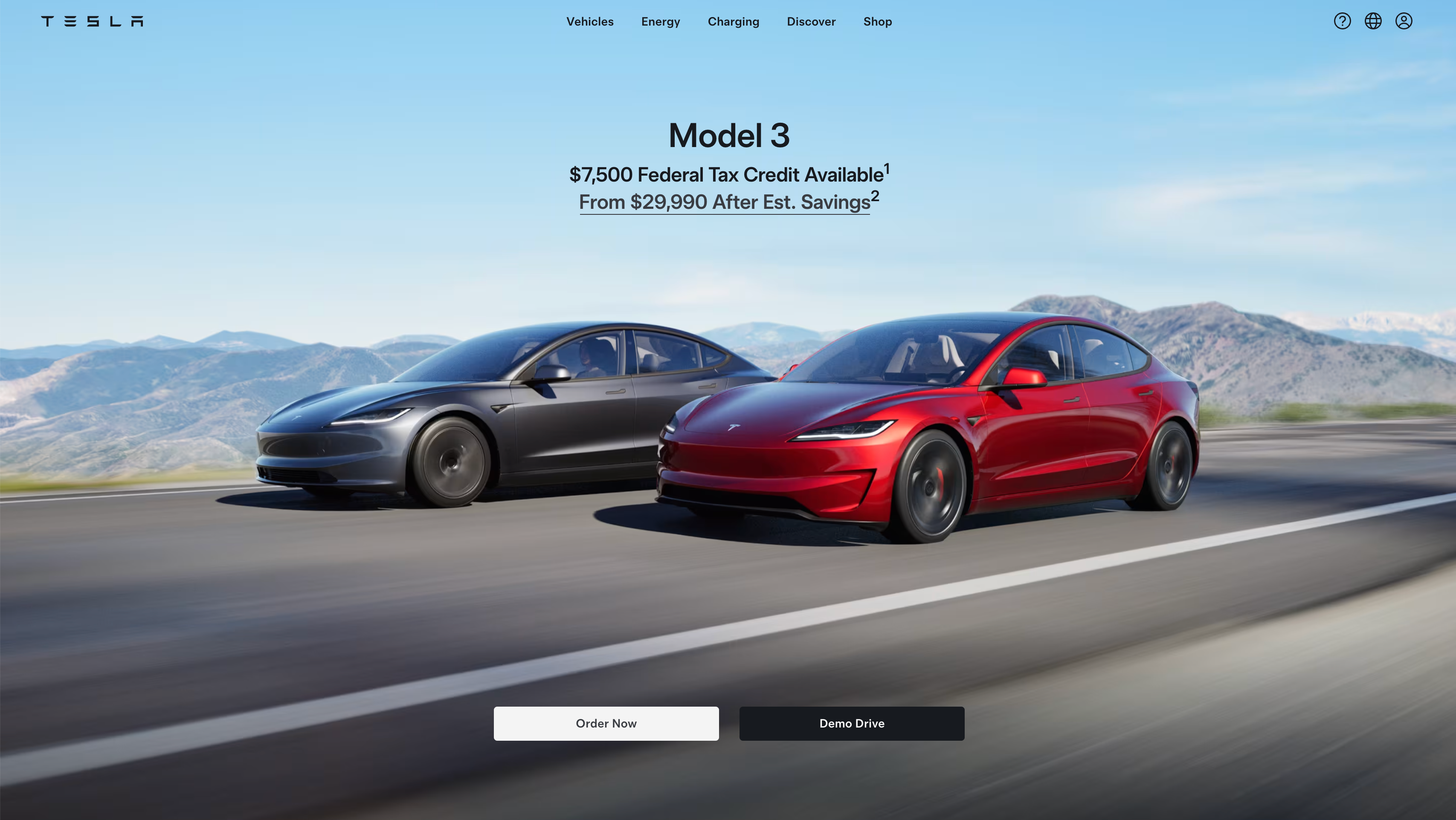
Tesla's hero images typically feature their vehicles in dramatic lighting, emphasizing their sleek, futuristic design. This visual approach aligns perfectly with their brand as an innovative, cutting-edge car manufacturer.

7. Storyblocks - Visual Storytelling
Storyblocks, a stock media company, uses a rotating gallery of vibrant images and videos as their hero. This showcases the diversity of their offerings while keeping the homepage dynamic and engaging.
Best Practices for Killer Hero Images
1. Keep It Relevant
Your hero image isn't just eye candy. It needs to align with your brand and message. I once worked with a tech startup that used a stock photo of a sunset for their hero image. Sure, it was pretty, but it did nothing to communicate what they actually did. We swapped it out for an image of their product in action, and boom – conversions jumped by 15%.
Pro Tip: Ask yourself, "Does this image tell my brand's story at a glance?" If not, keep looking.
2. Optimize for All Devices
We live in a multi-device world, folks. Your hero image needs to look sharp whether it's on a 27-inch monitor or a smartphone screen. Responsive design isn't just nice to have – it's essential.
I recommend creating at least three versions of your hero image:
- Desktop (1920x1080 px)
- Tablet (1024x768 px)
- Mobile (640x1136 px)
Tools like I Love Adaptive can help you check how your hero image looks across devices.
3. Balance Text and Image
If you're overlaying text on your hero image (and you probably should be), make sure it's readable. I've seen too many websites with beautiful images and completely unreadable text. It's a waste of prime real estate.
Here are some tips:
- Use contrasting colors
- Add a semi-transparent overlay
- Choose legible fonts that match your brand
Remember, if users can't read your message, it doesn't matter how pretty your image is.
4. Include a Clear CTA
Your hero section isn't just for show – it should guide users to take action. Whether it's "Sign Up Now," "Learn More," or "Get Started," make sure your call-to-action (CTA) stands out and is clearly clickable.
In a recent A/B test I ran, changing the CTA from "Learn More" to "Start Your Free Trial" increased click-through rates by 27%. Don't be afraid to be specific and action-oriented with your CTAs.
5. Don't Sacrifice Speed
Large, high-resolution images look great, but they can slow down your site. And let me tell you, slow load times are conversion killers. According to Google, as page load time goes from 1 to 3 seconds, the probability of bounce increases by 32%.
Optimize your images for web use. Tools like TinyPNG can compress images without noticeable quality loss. Also, consider using next-gen formats like WebP, which offer better compression and quality.

6. Use Video (Carefully)
Video backgrounds can be engaging, but they're a double-edged sword. They can grab attention, but they can also slow down your site and distract from your message.
If you do use video:
- Keep it short and looping (10-15 seconds max)
- Ensure it loads quickly
- Have a static fallback for slower connections
- Make sure it doesn't overshadow your main message
I once worked with an e-commerce site that saw a 5% increase in time on page after adding a subtle, looping video background to their hero section. But remember, what works for one site might not work for another.
7. Experiment with Interactivity
Interactive elements can make your hero section more engaging. This could be as simple as parallax scrolling or as complex as a mini-game. Just make sure it enhances rather than detracts from your main message.
A word of caution: I've seen interactive elements backfire when they're too complex or slow down the site. Keep it simple and purposeful.
8. Test, Test, Test
What works for one audience might not work for another. That's why A/B testing is so crucial. Tools like Optimizely or Mida.so can help you run these tests.
I always recommend testing at least two versions of your hero section. You might be surprised by what resonates with your audience.
FAQs: Your Hero Image Questions Answered
Q: How often should I update my hero image?
A: It depends on your site and goals. For evergreen content, you might change it seasonally or for special promotions. For news or trend-focused sites, you might update more frequently.
Q: Can I use gradients in my hero image?
A: Absolutely! Gradients can add depth and interest to your hero section. They're particularly useful for creating contrast for overlaid text.
Q: Should my hero image be the same on mobile and desktop?
A: Not necessarily. You might need to crop or adjust the image differently for mobile to ensure the key elements are visible on smaller screens.
Q: How do I choose the right color palette for my hero image?
A: Your color palette should align with your brand identity. Consider using a color wheel to find complementary or contrasting colors that work well together. Tools like Adobe Color can be helpful for this.
Wrapping Up: The Power of a Hero (Image)
In the end, a great hero image is about making a connection. It's your chance to wow visitors, communicate your value, and guide them towards taking action. Whether you're selling products, sharing ideas, or building a community, your hero image sets the stage for everything that follows.
So, take the time to craft a hero image that truly represents your brand and resonates with your audience. Test different options, gather feedback, and don't be afraid to get creative. With the right hero image, you can turn casual browsers into engaged users and ultimately, loyal customers.
Remember, in the world of web design, not all heroes wear capes – some just look fantastic at the top of your homepage. So go forth and create hero images that truly save the day for your website!


.svg)
