Browse conversion patterns from real sites, grouped by funnel stage and growth goal. Use them as inspiration for your next A/B test or personalization campaign.
Browse patternsStart broad or jump into a category. Each pattern includes the brand, context, and a shareable example page.
 Qive
•
User engagement & retention
Qive
•
User engagement & retention
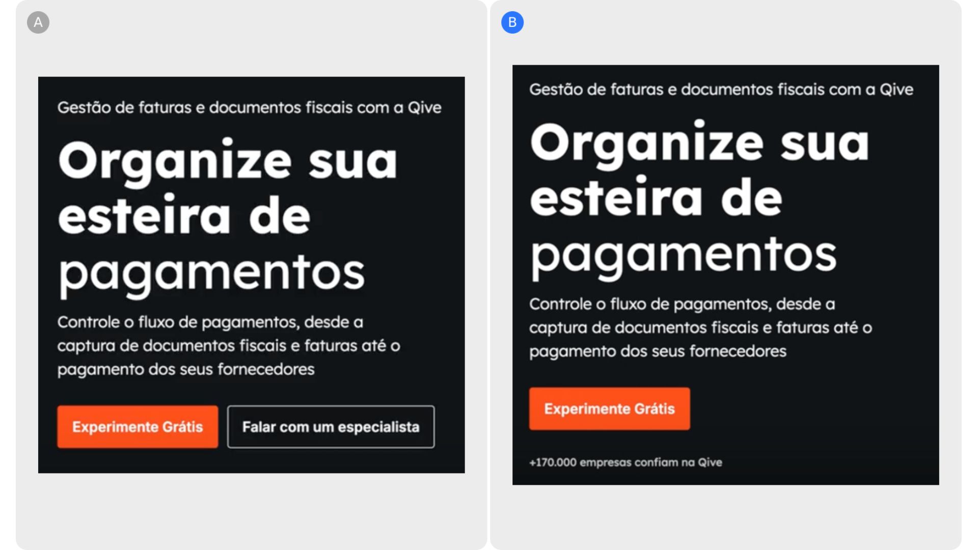
<p>Qive’s landing page initially presented users with multiple CTAs at the point of entry, which likely split attention and introduced hesitation rather than guiding action. By simplifying the experience to...

<p>Brown Thomas’s discounted product listing page shows a variety of discounted products but the discounted prices lacked prominence. By including a red tag next to the price that is highly visible, it drive...
<p>The page is currently extremely dense, with a hero search presented as a blank input that requires users to already know what to type, understand the correct terminology, and navigate a large, academic ta...
 Union Goods
•
User engagement & retention
Union Goods
•
User engagement & retention
<p>Union Goods’ hero section initially layered multiple elements—hero imagery, an Instagram hook, and a slogan—into a single visual space, increasing information density and making it harder for users to qui...
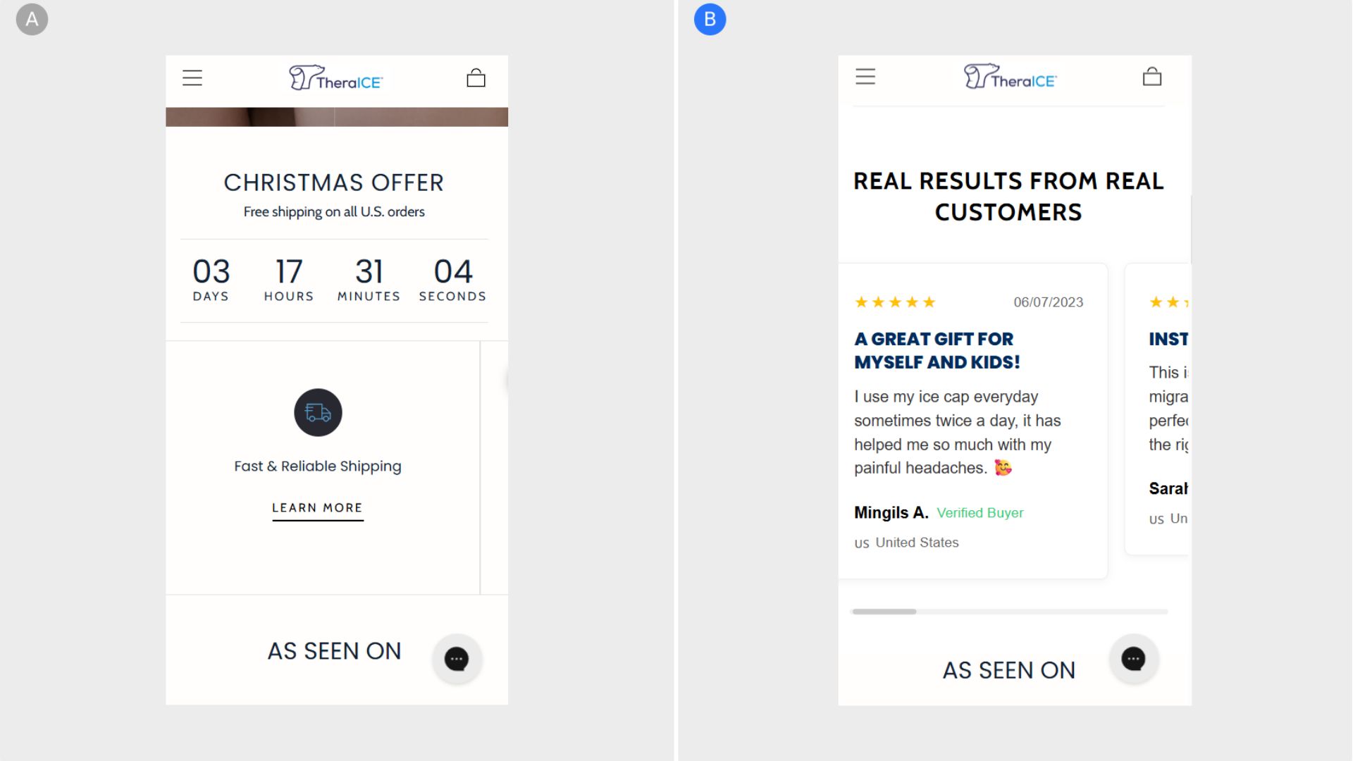
<p>TheraICE’s homepage previously required users to scroll significantly to encounter reviews, and even then, feedback was limited to star ratings on individual product cards. By introducing a dedicated revi...
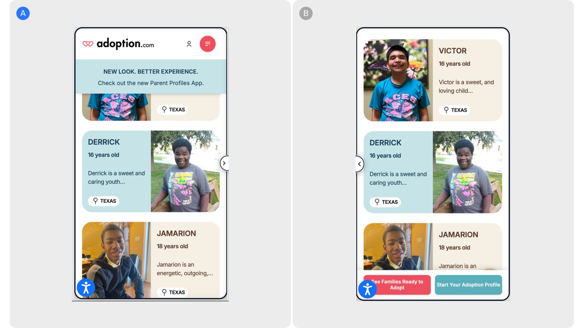
 Adoption.com
•
User engagement & retention
Adoption.com
•
User engagement & retention
<p>Adoption.com’s mobile experience previously allowed key CTAs to disappear as users scrolled, increasing the risk of drop-off at high-intent moments. The introduction of a sticky bottom bar keeps primary a...

<p>The product listing experience on Réglo initially required users to scroll extensively to locate relevant products for their dogs, increasing effort and slowing decision-making. By introducing a sticky fi...
Mida.so is a super lightweight A/B testing tool to help you experiment, analyze and implement conversion strategies in minutes.


.svg)

